Reimagining the in-store POS experience for customers that remains in line with Lush's digital and moral ethics.
Role
UX Designer, Lead Narrative Architecht
Time
Part-Time (3 Days)
Category
UX Design, Hackathon, Cross-Departmental Collaboration, Agile Framework
Problem Space
Lush has a very strict code of ethics, and it's important to them that they stick to them. Their challenge they faced, was to better align their Point of Sale experience with their digital code of ethics.
Solution
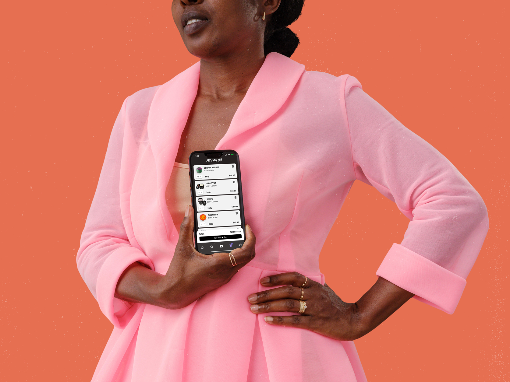
Collaborating with fullstack developers and data scientists, we created a POS experience that celebrates the user's sustainabilty efforts with each purchase, and separates the gap between "shopping" and "checkout".
Key Findings

Discover+Define
Discover + Define
A Point of Sale system aligned with Lush's Digital Ethics
Charitable contributions with purchases, cruelty free products, and being 10% employee owned since 2017 are some of the ways Lush has instilled their values into their business model. Now, Lush is looking to bring that to their Point of Sale system so that it is in line with their Code of Digital Ethics.
Goals
How Might We (original)
How might we craft an open-source innovative shopping experience that adapts to the needs of an ever evolving market, while leading by eample with our digital ethics?
This How Might We was provided to our team from Lush, but through the process we refined it for our work.


Discover + Define
What even is a Point of Sale anyway?
We've all experienced a Point of Sale, but we thought it'd be good to fully define it not in it's purpose but as an experience:
A Point of Sale is the relationship between a customer and a business in which both parties agree to the terms of a sale.
In every good relationship, each partner has agency which is the difference between passive agreement, and enthusiastic approval. Before we could fully redefine the How Might We, we had to do some research.
Research with the Data Scientists
Through an agile framework the UX team and the Data Scientist team both went ahead to sought out more information.
Data Scientist findings
UX Findings
Discover + Define
How Might We: Specified
So here is what we know:
This means our How Might We the team needs to ask has to address these issues. And so we went from:
How Might We (original)
How might we craft an open-source innovative shopping experience that adapts to the needs of an ever evolving market, while leading by eample with our digital ethics?
How Might We (Redefined)
How might we create an in-store shopping experience that is an extension of Lush's values so that users can shop barrier free and celebrated?
Meet Natasha!
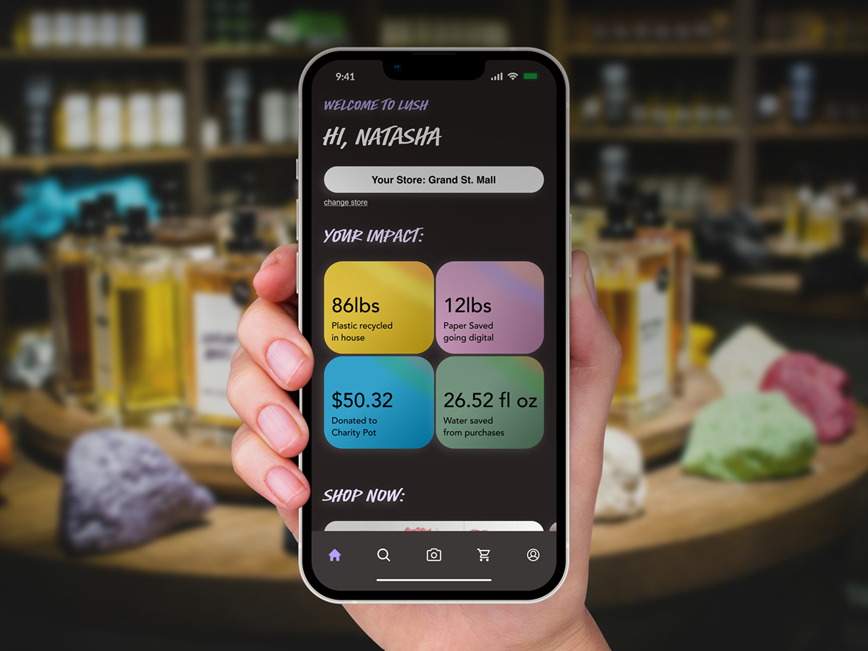
We took our data from interviews and created Natasha as a means to best understand our user's journey to solve that How Might We. Our solution should prioritize Natasha's desire for a clear and uninterupted experience, while also satisfying the core concept of the Lush's transaction and ethical constraints.
Discover + Define
Our team felt strongly that this solution should be on a mobile device. Natasha needs validation and communication while checking out her goods, and she already goes to her phone to get both of those things, so it should translate well. Although setting off confetti to celebrate each customers purchase sounds nice, it seems a little wasteful (also against Lush's values!)
We did a quick evaluation of their current app and learned a few things:
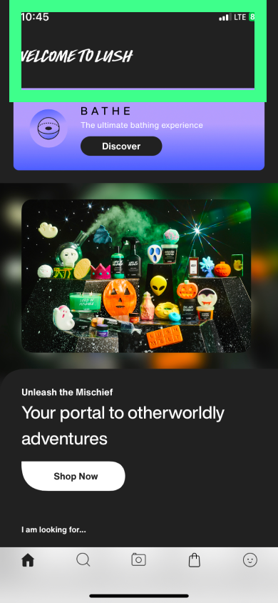
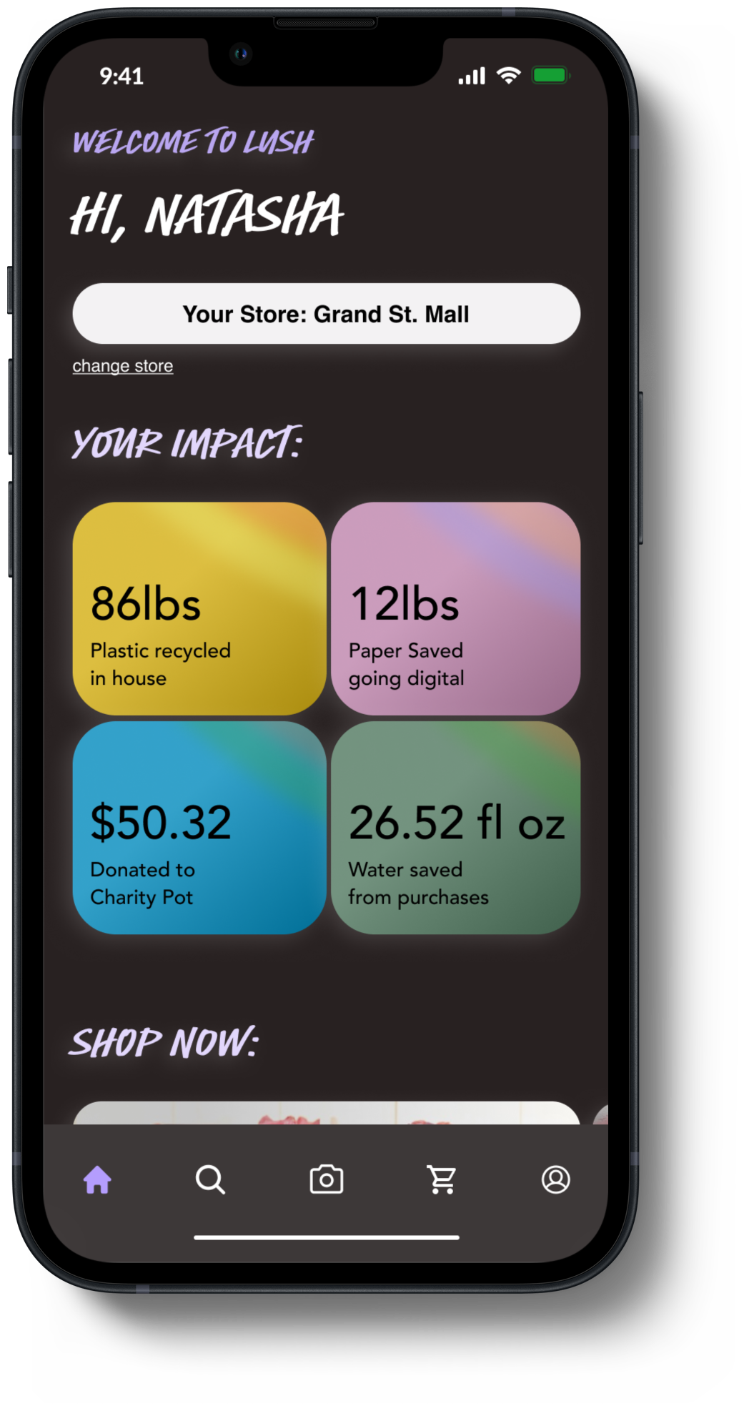
There is an opportunity to personalize the landing page for the specific user.
Lots of real estate here to play with the POS experience. How does a purchase contribute to Lush's values?
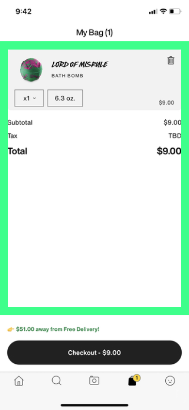
During this transaction, I wonder how we can celebrate the user?
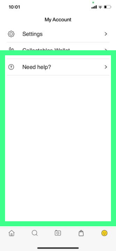
This is the profile page, but doesn't give any information that might help our problem. How can we integrate a profile and landing page?
Develop+Design

Develop + Design
Key Features
Our features needed to solve Natasha's pain points she had, so did we do it?
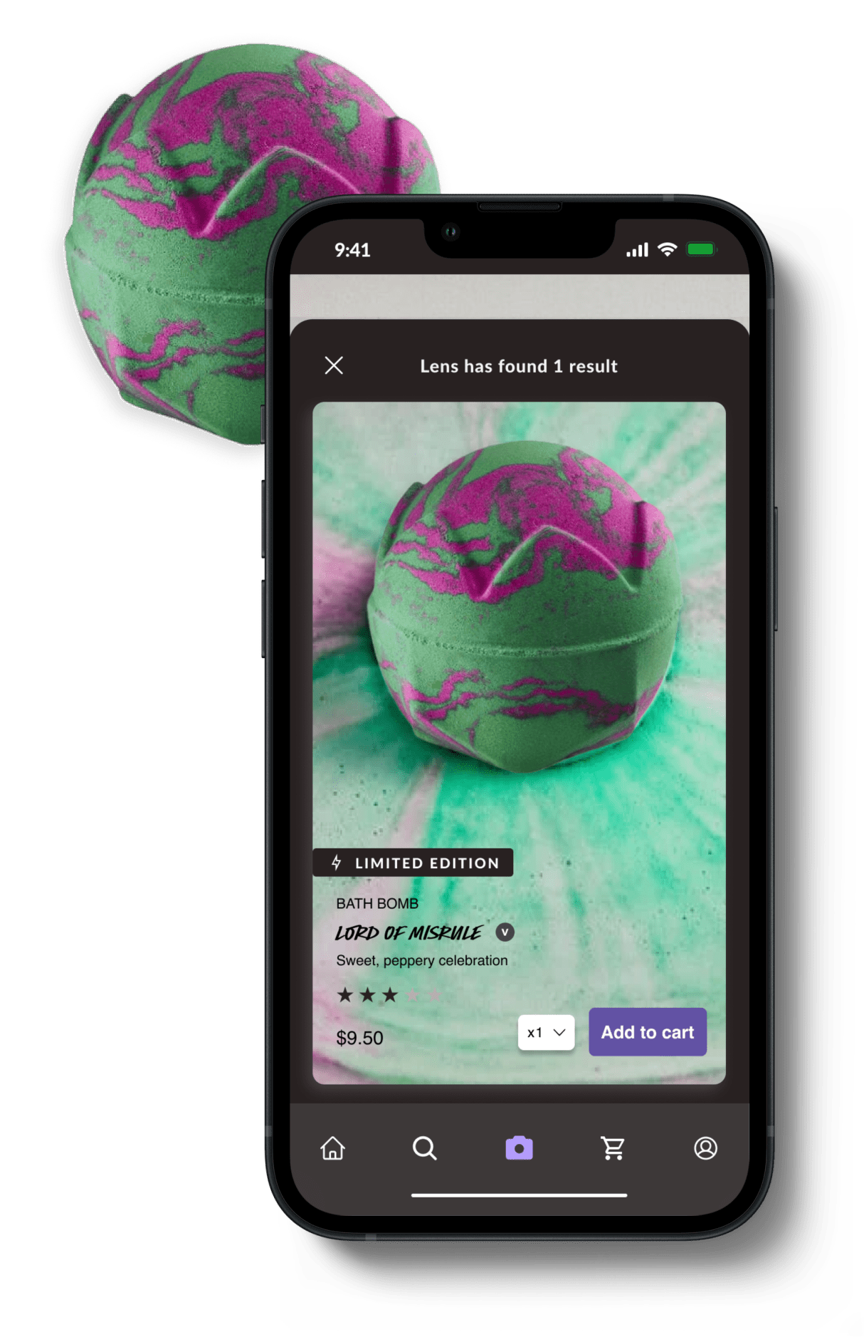
Shopping with the Lush Lens
Pain Point
Natasha feels that the checkout process is isolated from the shopping experience.
Solution
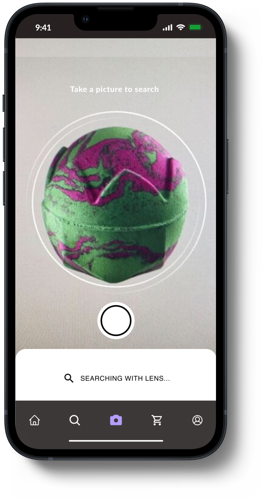
We optimized the Lush Lens, which originally only pulled information about the product, to now also add to cart. Associcates, who she enjoys speaking to, will gather her items when she's ready to check out, and can tap to pay on devices the associates will walk around with.
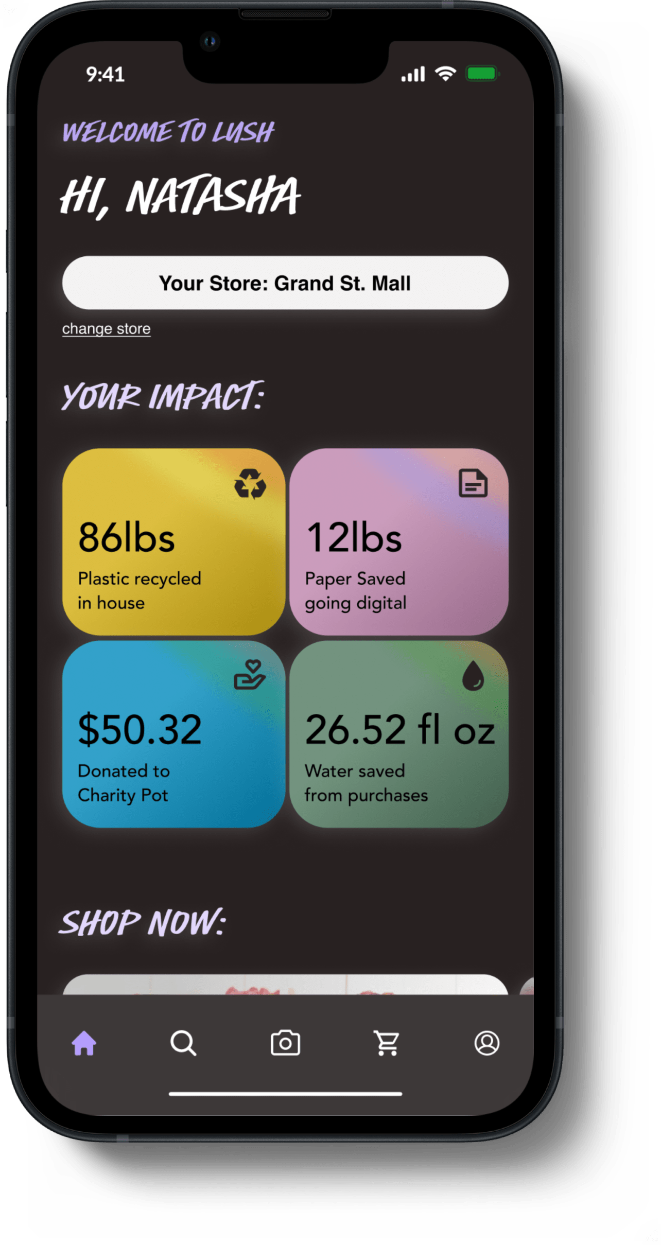
Your Personal Impact
Pain Point
Natasha doesn't like when the companies she shops at don't share her values.
Solution
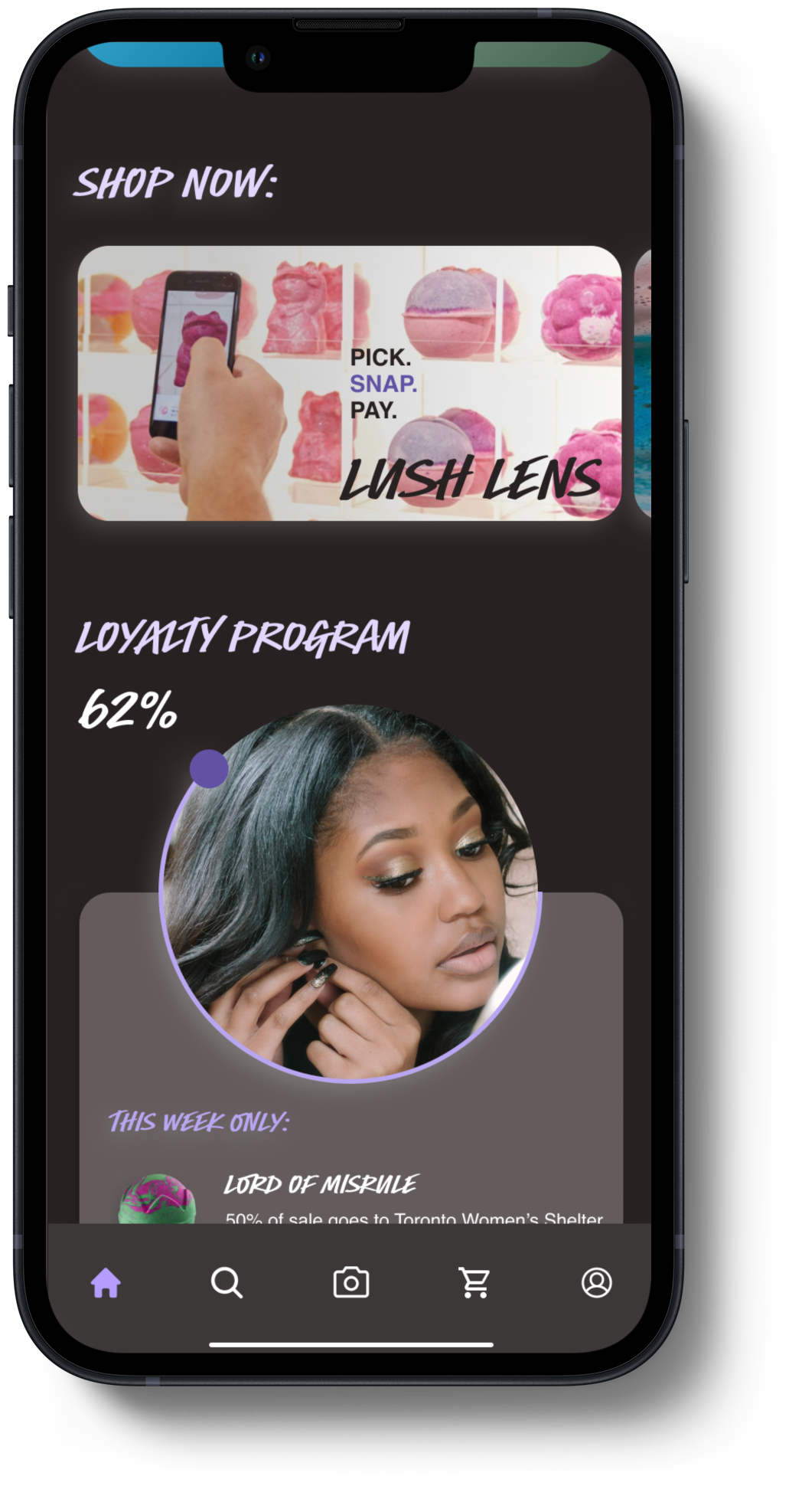
Based on the research the data team discovered, we knew that the loyalty and consistency of customers was dependent on companies transparency of values. Because of this, we included a feature that would track the customer's contribution to sustainable efforts with every purchase at Lush's stores.
Final Insights
Final Insights
Working across departments within an agile framework highlighted a couple of remarkable insights.
Everyone was always working on something. By defining our MVP early on the process, the developers got to build out the checkout system, the data scientists sought our data on Lush's sustainability efforts, and the UX team created the look and user task flow. Each person conducted hand offs to the point person on each team, and we met daily to ensure we were on the same page.
Just like in life, it's important to communicate any and all needs. Our friends in development and data science did not know in detail what the "How Might We" was, just like we as the UX team didn't instantly know what "open source code" was. Communicating needs gets everyone on the same page!
Next Steps
Field Tests
Our next steps should Lush choose to implement this solution would be to test this user flow out in the field! Because the Lush Lens is a current feature within the app, our team wasn't as concerned with rigorous user testing. Our answers to fine tuning this solution would come from testing within the experience!