Helping users vote with confidence and view better candidates for them in one app.
Role
UX Designer
category
UX Design, Mobile App (iOS), Branding
problem space
Voting isn't as simple as it seems. There are so many elections for so many officials, and there's never enough time in the day to keep up with their voting records. Users need a more straight forward way to find politicians who are aligned with them.
Solution
By collecting secondary research, qualitative data, and interviewing young voters in NYC between the ages of 18-29, I identified core pain points, motivations, and behaviors. Those data points were used to inform my design strategy to better identify which candidates were best to represent the user in public office.
Key Findings
• 84% of users expressed a lack of confidence in who to vote for, but after testing the prototype, 92% said they gained confidence.
• Taking a political survey to match with candidates was a feature that users expressed excitement for.
• Users liked the ability to toggle between state, local, and national elected officials.

discover + define
Discover + Define
Voting : An act of confusion
Voting can feel like a laborous task with little to no instruction manual. Most of the time, national politics will take the spotlight within mainstream media, and it's usually about a candidate who doesn't even represent the voter. This causes civic fatigue, confusion, and hopelessness.
Goals
Problem Statement
Young voters within the United States want to change the way things are run in this country, but do not feel like they know as much as other voters, and are likely to note vote because of it.
How Might We
How might we empower NYC voters between the ages of 18-20 feel confident about their local, state, and national political voting decicisons?
Secondary Research + Industry Interview
Research creates the foundation with which we'll build on! To define my How Might We above, I let my curiosity lead my search.
Secondary Research
The secondary research that was found painted a clear story: Young voters (76%) feel that they have the power to change the way things are run in this country, however half of these voters (50%) feel that they don't have enough information as other people, and this leads to not voting entirely (20%).
Industry Interview
I spoke to Joseph Graeney, a former Congressional Intern and Senior Manager for Policy Outreach at the Millenial Action Project in order to get his expertise.
Discover + Define
User Interviews
For anonymity, I've used random pictures and names for our interviewers.


Discover + Define
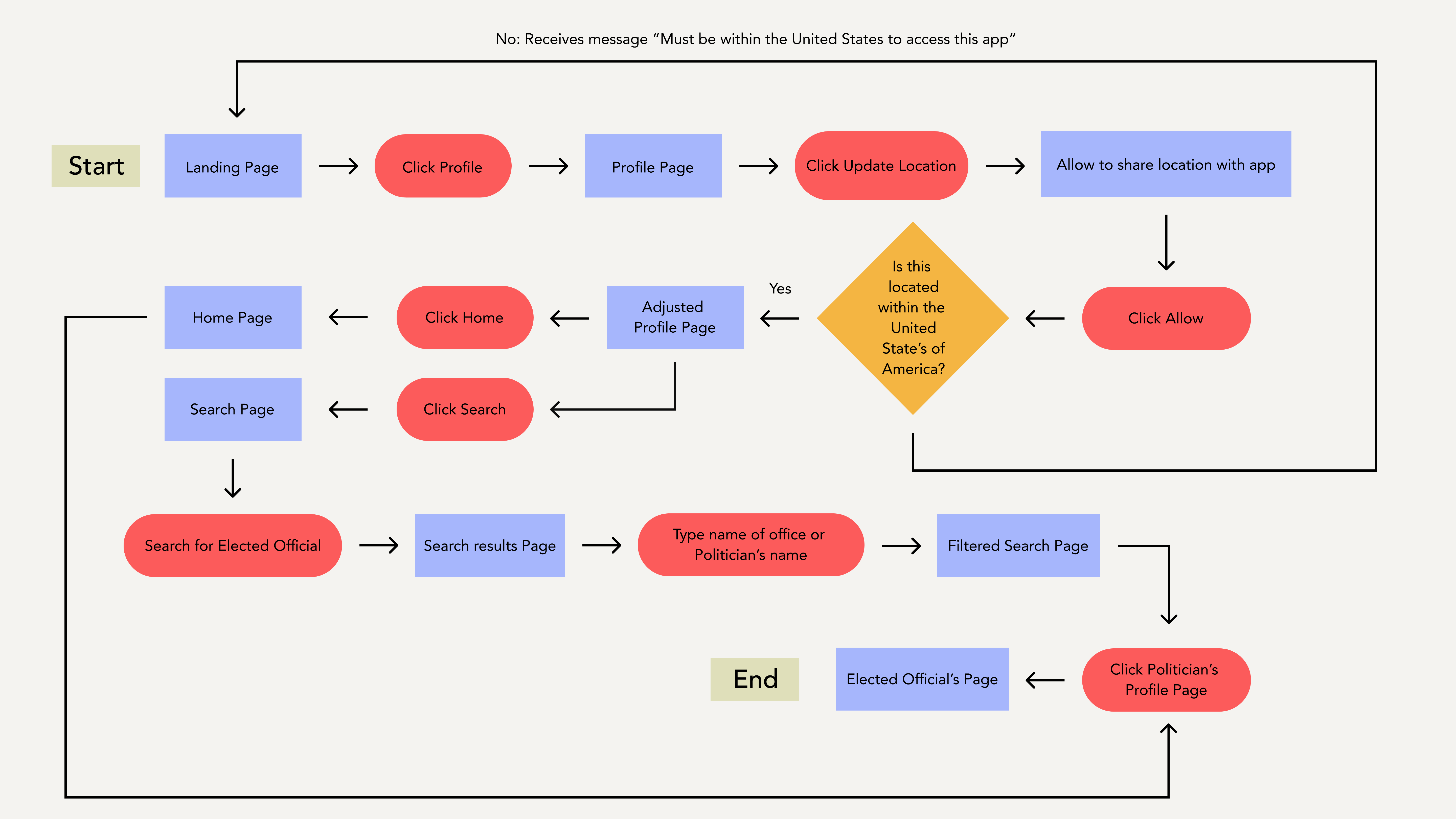
Task Flow
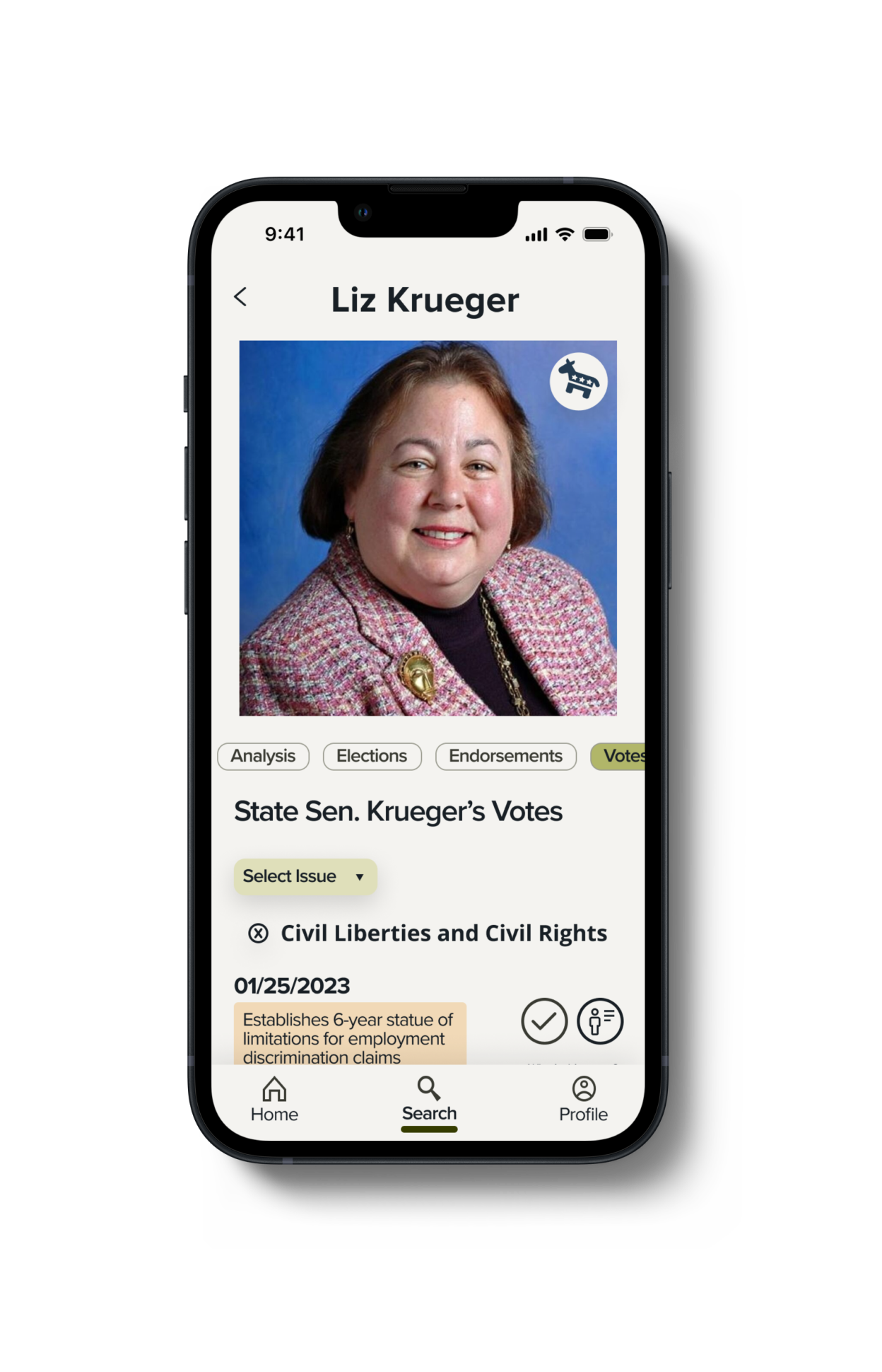
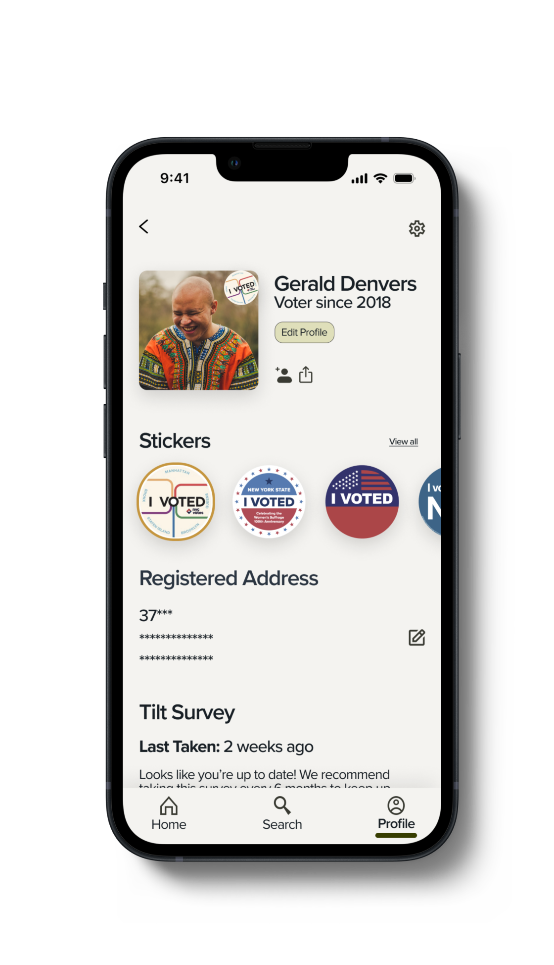
As a user Gerald wants to look up their state senator so that he feels confident she's accurately representing him.
Discover + Define
Ideate. Design. Test. Repeat.
The core of the UX process! I conducted user tests with 15 different users across three different rounds. Changes were plotted on a design priority matrix and that created a design strategy to implement changes.
User Test Findings - Round 1
User Test Findings - Round 2
User Test Findings - Round 3
Final Design
Develop+Design


Develop + Design
Key Features
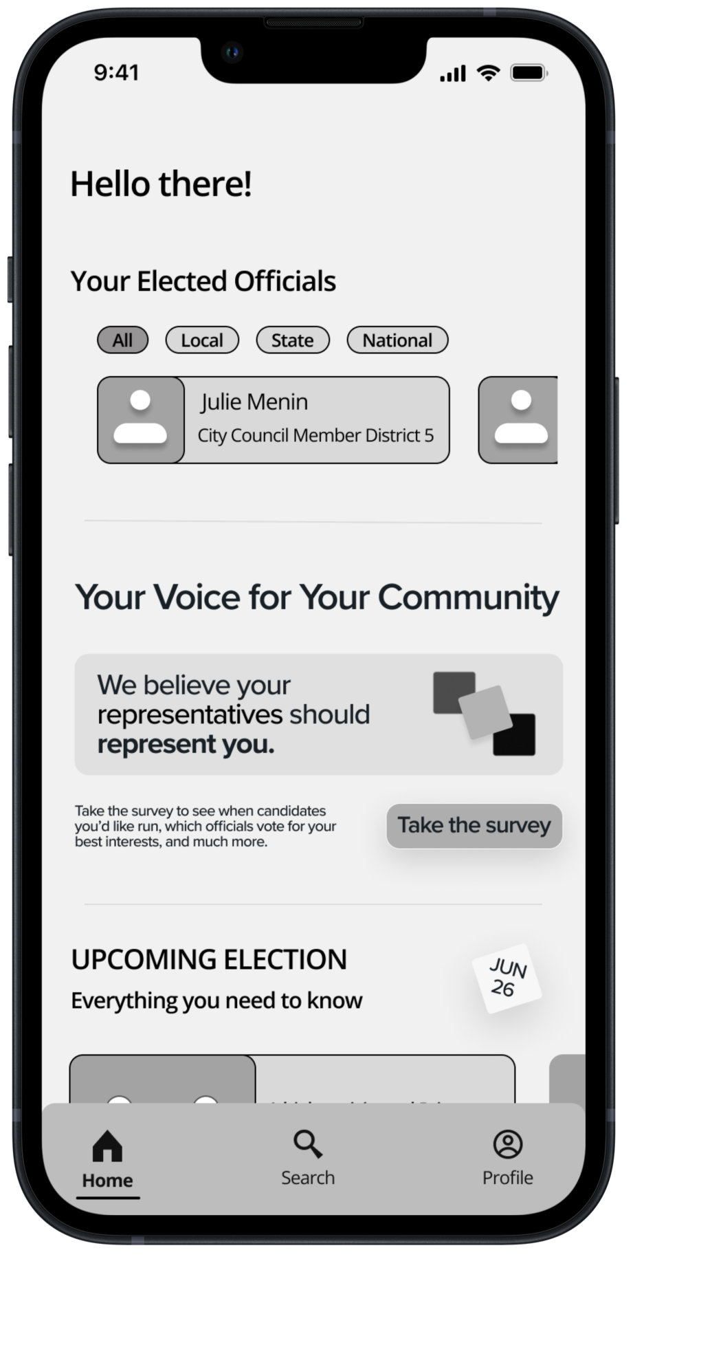
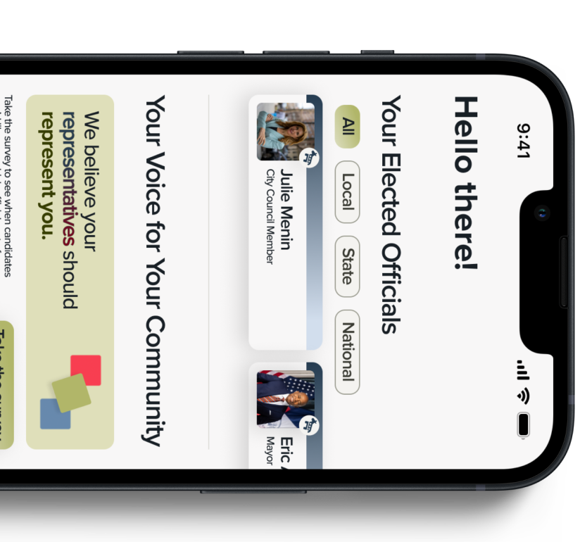
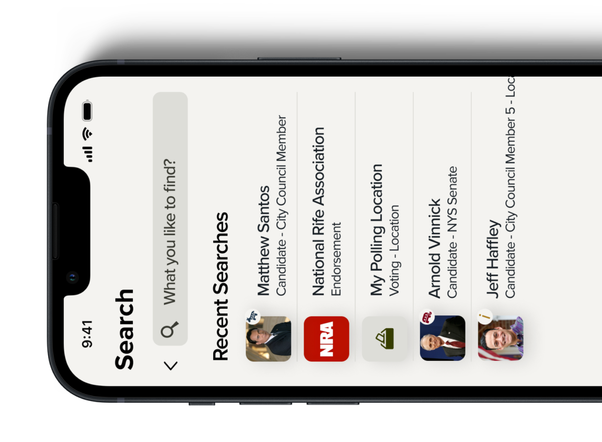
I built out a couple of key features that were generated through authored user stories that helped ease Gerald's pain points.
A note:
The political survey will require some collaboration with Data Scientists who have a background in political science. Since this is core to the purpose of the app, the prototype functions as if Gerald has already taken the survey.
final insights
Final Insights
Next Steps
With more time and funding, I'd split my time revisiting parts of the process, as well as looking to building out features.
Revisit:
Future Thinking: